Landing Page
How often do you leave a website the very minute you visit it? For most internet users, it takes only 0.05 seconds to decide whether they want to stay or leave at once. Evidently, your landing page can’t be high-converting if visitors won’t stay on it.
Moreover, 75% of your website visitors will judge your company based on your landing page and its design. That’s how important a landing page is for your business. Read this essential guide to learn how you can easily create a really high-converting landing page!
What’s a Landing Page?
Let’s just make sure we are on the same page. Landings are such web pages that are created for marketing purposes or advertising campaigns. So, the main goal of a landing is to sell your product or service.
Landing pages are often confused with home pages, but they are not the same. The difference is basically the following. There’s only one home page on a website, yet there can be several landings.
Home pages are usually meant for informing about the website, while landings serve to sell. Nowadays, home pages are usually considered landings. Because not only they inform about the website, but also have CTA (call-to-action) buttons to collect leads and boost sales.
Consequently, a high-converting landing page should inspire trust in your visitors. Thus, it should be well-designed and have relevant content.
Mind there are different types of landings. Some of them are meant as sales pages, while others serve as sales funnels. Depending on the goal, you might want to include a CTA button, contact form, or even some downloadable resource like ebooks
So, if you want to create a really high-converting landing page, you’d better know your goal from the very beginning. That’s how you can build a successful marketing campaign for your business!
Tips on Creating Landings that Convert
No worries if you have no idea how to create landings at all. We are here to guide you. And it’s not difficult at all. Just follow these easy steps, and you’ll end up with a truly stunning landing that will bring you a heck of a lot of money! Ready?
Choose a Decent Website Builder
The best advice we can give you on creating landings that convert is to choose the right builder. This is very important in fact. Especially, if you know neither coding nor design, and have no experience in website creation.
We recommend our partner Weblium. This website builder is so very intuitive and there are plenty of ready-made templates for landings. All you need is just to choose the one that appeals to you most and start filling it with your own content.
Besides, all the essential elements for a high converted landings are already included in Weblium templates. Which means that you don’t really need to reinvent the wheel. Just use the ready working solutions instead!
Not to sound proofless, we’ll show you a really great example of a high-converting landing page created on Weblium. In fact, there’s lots of other worthy templates to choose from!
If you decide to create your landing on Weblium, use the exclusive promo code JIVOCHAT30 to get a 30% discount for the Weblium annual PRO plan!
First Screen Really Matters
The first screen of the landing is basically your website identity. Remember, your visitors won’t decide longer than 0.05 seconds to decide whether to stay or leave.
If they leave at once, your landing will never convert. That’s why it’s truly important to create a truly powerful and visually appealing first screen. That’s the fundamentals of landings that convert really great.
Here’s an example of a perfectly designed first screen that magnetizes at first sight! So, you definitely won’t leave such a website at once, huh?
Pay attention to the header. On the top left, there’s a logo. It’s really important since it represents your brand.
The words you see in line with the logo is basically your landing navigation. Make it simple, clear, and user-friendly.
Also, include social network buttons to let people promote your cool landing by sharing it with friends. That’s how it gets high-converting!
To highlight the most important sections on your landing, use the buttons. It’s also kind of a part of your landing navigation.
The ‘Who We Are’ button gets you right to the company info. Since there’s no place for much text on the first screen, it’s a really great way to show your website visitors where they can find more info about your company.
Another button ‘Get in Touch’ is probably the most essential element of a high-converting landing page. That’s how you collect your visitors’ data contact info to use for the sale funnel.
As they press this button, they get to see your contact form. Here your visitors can fill in their essential contact info (name, email, and phone) as well as yours (location, working hours, email, and phone).
For a high converting landing, it’s quite essential to provide your contact info next to the contact form. That’s how you kind of tell your potential customers, See, that’s how you can find us. And we can get in touch with you too. Won’t you share your contact info too? Just like we did.’ You won’t believe it, but this approach really works! Just check it out yourself!
These are basically the main things to include on your first screen if you want your landing page to convert really well.
Make Your Landing Trustworthy
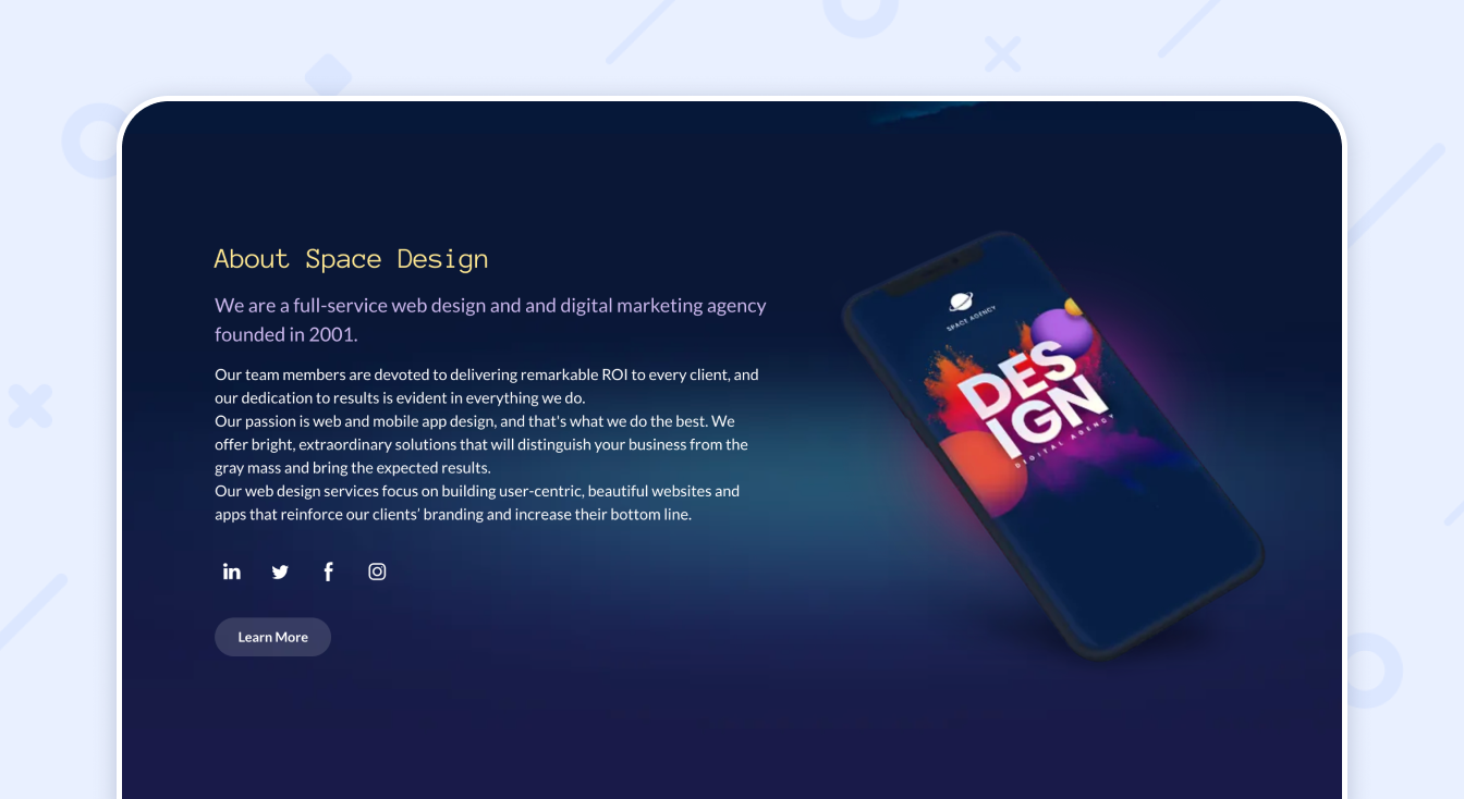
Your landing will convert only if it inspires trust in your customers. That’s why it’s quite essential to include more info about your company and products or services you sell. Use numbers to make it look really persuasive and trustworthy. Here’s a really great example
It’s also great to show your company’s history to customers. Especially, if you have a lot to say about it. No worries though if it’s rather young. You can simply skip this. ‘Cause you already have some info about the company anyway on your landing.
And it’s even better if your company has any awards. Make sure to include them on your main page. Awards usually work as the best argument for your visitors that you can be trusted.
Any idea what also makes your landing trustworthy? People. The ones who work for you. Your team. Make sure to include their contact info as well. That will make your company look even more reliable in your visitors’ eyes.
Finally, to win their trust for good, include your customers’ feedback on the landing. No doubt, customer reviews always speak for themselves. If you show you visitors that people trust you, why wouldn’t they trust you too?
Provide Details on What You Offer
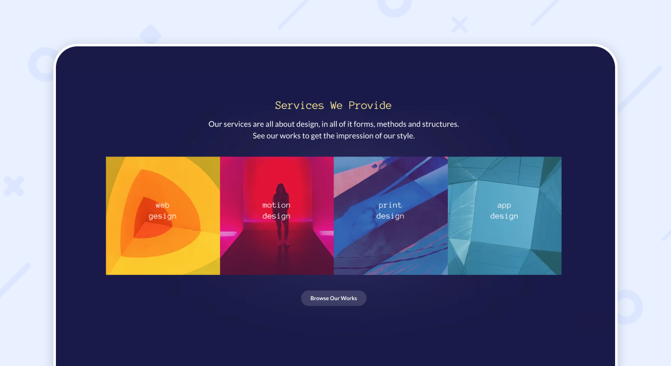
The main goal of your landing page is to sell, right? That’s why it’s highly important to showcase your products or services – whatever you want to sell.
It’s even better if you have a portfolio. Make sure to include some of the best of your works on the landing page. And don’t forget to add a button with more.
Your visitors want to see as many of your offers as possible. That’s how they get an idea of what you can. And, most importantly, what they can get from you. So, that’s how you persuade your potential customers that you are a professional and they really need your services.
To make your landing page high-converting, you also need to showcase the privileges of dealing with your company. Describe all the benefits of your company to persuade the visitors that you are better than your competitors. Or even more. Tell them why you are the best on the market.
We also highly recommend describing the process of working with your clients. Tell them what steps they need to follow in order to get your offer.
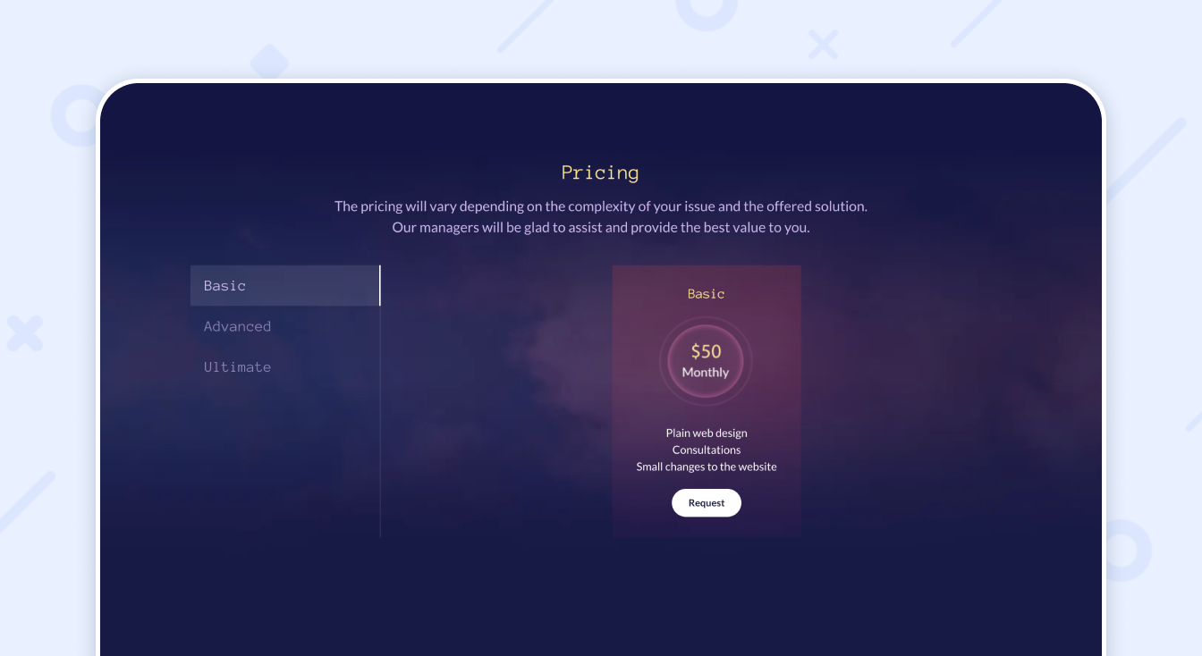
Oh and don’t forget to include your pricing. Usually, people want to know how much they have to pay before contacting you.
Of course, it’s not obligatory to include your pricing list. But that’s how you increase your conversion rates. Because if they contact you, and it turns out too expensive or seems suspiciously cheap to them, they won’t proceed with your company.
That’s why it’s better to put everything on the table at once. In this case, you can be more or less sure that those who contact you are really interested in your offers. Consequently, that’s how your landing gets high-converting!
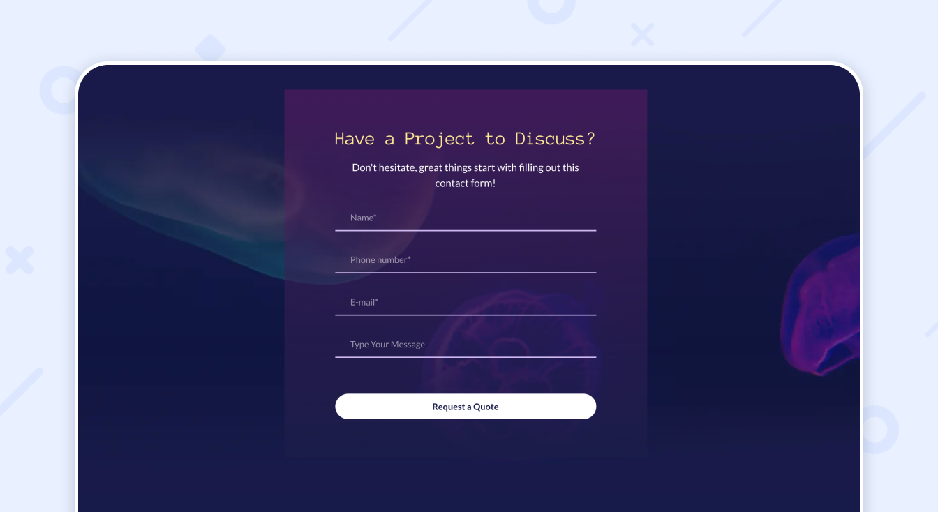
Besides, don’t forget to include your call to action. The best way is to include a contact form so that your potential customers can get in touch and clarify all the details.
Add Helpful Info to Your Landing
The more useful info you give to your website visitors, the higher chances they become your customers. Even if they won’t pay you now, they will keep coming to your site. And sooner or later, you will get their money.
So, how can you keep feeding your visitors so they eventually become clients? The answer is really simple. Add a blog to your website. And make sure it’s visible on the landing.
Blog is the best thing you can add to your website. Not only does it attract traffic to your website that you can convert, it also helps to boost your authority. The more helpful your articles are, the more trustworthy you get in your visitors’ eyes.
Besides, make sure to include the FAQ section on your landing. Add there all the relevant info about your company and services as well as peculiarities of working with you.
Think of what questions your visitors might have and do your best to answer them all. As precisely as you can. Don’t underestimate the FAQ section. In fact, it’s truly an important contributor to your landing conversion.
It’s also quite important to add the ‘Contact Us’ button under the FAQ section. So that your potential customers can ask you the questions they still have unanswered. Besides, it’s a great chance for you to get in touch with them.
And, finally, the footer of your landing page. Basically, it’s very similar to the header. It contains mostly the same info – your logo, navigation, social media buttons. The only difference is, your footer should include your copyright. That’s how you protect your authorship.
Summary
As you can see, it’s quite easy to make a high-converting landing page after all. Especially, if you choose the right builder for its creation.
Want to make as powerful and appealing a landing page as the one we have shown you? Opt for Weblium, and you’ll be so very amazed by your sky-rocketing conversions!
Just a kind reminder, use the exclusive promo code JIVOCHAT30 to get a 30% discount for the Weblium annual PRO plan!.


![[about]](https://blogger.googleusercontent.com/img/b/R29vZ2xl/AVvXsEibLcRM-BG98pdQLuaaZLksdFqZvbLgkgU-5QZUkvhImubRjQLFbLHxrctgyECTLmMSZGRAUfuAWTIPcT7UA-qpm6eC8dM4JZV51HZiY9HMxZtNIllBAqVloYl_5-wTlkdRoDqZREDjJW7p/s348/Capture.JPG)
No comments:
Post a Comment